Introduction of Matplotlib :
Matplotlib is capable of creating most kinds of charts, like line graphs, scatter plots, bar charts, pie charts, stack plots, 3D graphs, and geographic map graphs.
Matplotlib is a comprehensive library for creating static, animated, and interactive visualizations in Python.
Matplotlib is an amazing visualization library in Python for 2D plots of arrays. Matplotlib is a multi-platform data visualization library built on NumPy arrays and designed to work with the broader SciPy stack. It was introduced by John Hunter in the year 2002.
Python Plotting With Matplotlib :
First, in order to actually use Matplotlib, we're going to need it!
If you have a later version of Python installed, you should be able to open cmd.exe/terminal and then run: pip install matplotlib
Note: You may need to do C:/Python34/Scripts/pip install matplotlib if the above shorter version doesn't work.
Mataplotlib use in Machine Learning :
It is use for Data visualization in Machine Learning.
Examples of Matplotlib :
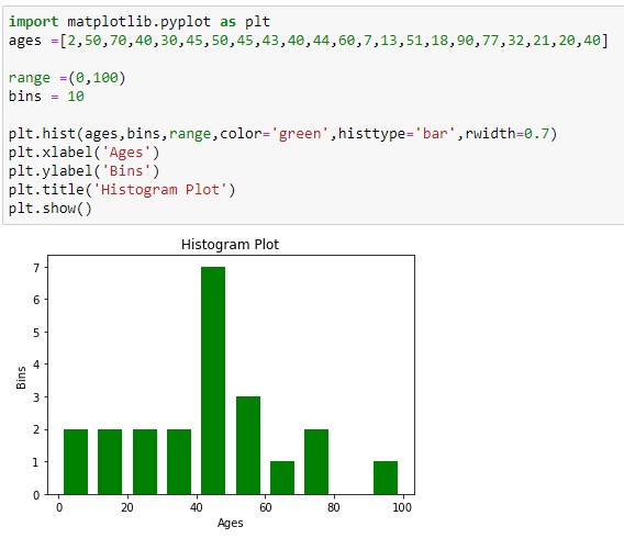
Bar Graph -


 一一一一一一一一一一一一一一一一一一一一一一一一一一
Example
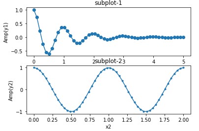 import numpy as np
import matplotlib.pyplot as plt
x1 = np.linspace(0.0,5.0)
x2 = np.linspace(0.0,2.0)
y1 = np.cos(2*np.pi*x1)*np.exp(-x1)
y2 = np.cos(2*np.pi*x2)
plt.subplot(2,1,1)
plt.plot(x1,y1,'o-')
plt.title('subplot-1')
plt.xlabel('x1')
plt.ylabel('Amp(y1)')
plt.subplot(2,1,2)
plt.plot(x2,y2,'.-')
plt.title('subplot-2')
plt.xlabel('x2')
plt.ylabel('Amp(y2)')
plt.show()
一一一一一一一一一一一一一一一一一一一一一一一一一一一

一一一一一一一一一一一一一一一一一一一一一一一一一一一

一一一一一一一一一一一一一一一一一一一一一一一一一一一
 import matplotlib.pyplot as plt
import numpy as np
x = np.arange(0,2*np.pi,0.1)
y1 = np.sin(x)
y2 = np.cos(x)
plt.plot(x,y1,label='Sin')
plt.plot(x,y2,label='Cos')
plt.xlabel('x-axis')
plt.ylabel('y-axis')
plt.legend()
plt.title('Sine & Cosine Functions')
plt.show()
一一一一一一一一一一一一一一一一一一一一一一一一一一一
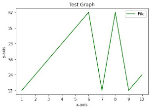 import matplotlib.pyplot as plt
import csv
x= []
y= []
with open('test.csv','r')as csvfile:
plots = csv.reader(csvfile)
for col in plots:
x.append(col[0])
y.append(col[1])
plt.plot(x,y,label='File',color='green')
plt.xlabel('x-axis')
plt.ylabel('y-axis')
plt.title('Test Graph')
plt.legend()
plt.show()
#two file create one is test.text and another one test.csv . Both file put in when you save all python folder
一一一一一一一一一一一一一一一一一一一一一一一一一一一
Matplotlib is capable of creating most kinds of charts, like line graphs, scatter plots, bar charts, pie charts, stack plots, 3D graphs, and geographic map graphs.
Matplotlib is a comprehensive library for creating static, animated, and interactive visualizations in Python.
Matplotlib is an amazing visualization library in Python for 2D plots of arrays. Matplotlib is a multi-platform data visualization library built on NumPy arrays and designed to work with the broader SciPy stack. It was introduced by John Hunter in the year 2002.
Python Plotting With Matplotlib :
First, in order to actually use Matplotlib, we're going to need it!
If you have a later version of Python installed, you should be able to open cmd.exe/terminal and then run: pip install matplotlib
Note: You may need to do C:/Python34/Scripts/pip install matplotlib if the above shorter version doesn't work.
Mataplotlib use in Machine Learning :
It is use for Data visualization in Machine Learning.
Examples of Matplotlib :
Bar Graph -
一一一一一一一一一一一一一一一一一一一一一一一一一一一
一一一一一一一一一一一一一一一一一一一一一一一一一一一
Example
import numpy as npimport matplotlib.pyplot as plt
x1 = np.linspace(0.0,5.0)
x2 = np.linspace(0.0,2.0)
y1 = np.cos(2*np.pi*x1)*np.exp(-x1)
y2 = np.cos(2*np.pi*x2)
plt.subplot(2,1,1)
plt.plot(x1,y1,'o-')
plt.title('subplot-1')
plt.xlabel('x1')
plt.ylabel('Amp(y1)')
plt.subplot(2,1,2)
plt.plot(x2,y2,'.-')
plt.title('subplot-2')
plt.xlabel('x2')
plt.ylabel('Amp(y2)')
plt.show()
一一一一一一一一一一一一一一一一一一一一一一一一一一一
一一一一一一一一一一一一一一一一一一一一一一一一一一一
一一一一一一一一一一一一一一一一一一一一一一一一一一一
一一一一一一一一一一一一一一一一一一一一一一一一一一一
import matplotlib.pyplot as pltimport numpy as np
x = np.arange(0,2*np.pi,0.1)
y1 = np.sin(x)
y2 = np.cos(x)
plt.plot(x,y1,label='Sin')
plt.plot(x,y2,label='Cos')
plt.xlabel('x-axis')
plt.ylabel('y-axis')
plt.legend()
plt.title('Sine & Cosine Functions')
plt.show()
一一一一一一一一一一一一一一一一一一一一一一一一一一一
 import matplotlib.pyplot as plt
import csv
x= []
y= []
with open('test.csv','r')as csvfile:
plots = csv.reader(csvfile)
for col in plots:
x.append(col[0])
y.append(col[1])
plt.plot(x,y,label='File',color='green')
plt.xlabel('x-axis')
plt.ylabel('y-axis')
plt.title('Test Graph')
plt.legend()
plt.show()
#two file create one is test.text and another one test.csv . Both file put in when you save all python folder
一一一一一一一一一一一一一一一一一一一一一一一一一一一


No comments:
Post a Comment